How to Make Your Website Mobile-Friendly and Responsive
In today’s digital world, having a mobile-friendly and responsive website is no longer optional—it’s a necessity. With more than half of global web traffic coming from mobile devices, businesses must ensure their websites provide a seamless experience across all screen sizes. If your site isn’t optimized for mobile, you risk losing potential customers and hurting your search engine rankings.
Better User Experience – A responsive design ensures visitors can easily navigate your site on any device.
Higher Search Rankings – Google prioritizes mobile-friendly websites in search results.
Increased Conversions – A smooth mobile experience leads to more engagement and sales.
Lower Bounce Rates – Users are more likely to stay if your site loads quickly and looks great on their phones.
Key Steps to Make Your Website Mobile-Friendly
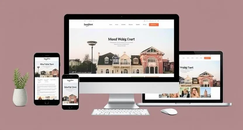
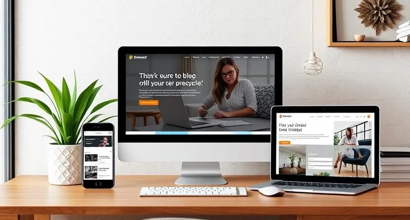
1. Use a Responsive Design A responsive website design automatically adjusts to fit any screen size. WordPress, for example, offers many responsive themes that make this process easy.
2. Optimize Loading Speed Mobile users expect fast-loading pages. Compress images, minimize code, and leverage browser caching to improve speed.
3. Simplify Navigation A clutter-free menu with clear CTAs (Call-to-Actions) enhances usability on small screens.
4. Ensure Readable Text Use legible fonts (at least 16px) and avoid long paragraphs. Break content into smaller sections for better readability.
5. Test on Multiple Devices Check how your site looks on smartphones, tablets, and desktops using tools like Google’s Mobile-Friendly Test.
6. Avoid Pop-Ups Intrusive pop-ups can frustrate mobile users. If necessary, use smaller, easy-to-close banners.
7. Optimize for Touch Screens Buttons and links should be large enough to tap without zooming in.
Why Choose Sivakumar Solutions?
✅ Affordable Pricing – Just ₹7,999 for website design ✅ No Upfront Payment – Pay after project completion ✅ 3 Months Free Maintenance ✅ 1 Year Free Hosting ✅ Expert Support & Consultation
Looking for Professional Website Design Services?
If you need a mobile-friendly, responsivewebsite, sivakumar.solutions offers affordable website design services near me (Hyderabad).
Our Package Includes: ✅ Professional Website Design – ₹7,999 only! ✅ 3 Months Free Maintenance ✅ 1 Year Free Hosting ✅ Payment After Project Completion